A Home Automation Startup.

This is a case study offering potential solutions to some of Picostone app’s problems.

My role

App Critique

UX Research

Wireframes

Devices

iPhone 6s

Smart watch

Mobile Application

Title

User Experience Intern

Introduction.

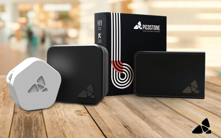
The objective of Picostone is to automate rooms and make them energy efficient. Picostone has 2 devices - BASIC and POLAR. Basic is a small WiFi-based device that fits right behind the switchboard and lets users operate lights and fans through their smartphones. Polar, on the other hand, works well with air conditioners.

PICOSTONE DEVICES

Problem.

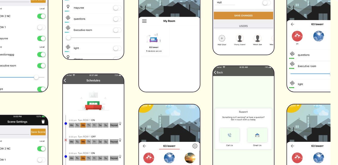
After launching the Picostone app, even though it was quite functional it failed to deliver a great experience to the users. The company received feedback from its users such as they were getting lost in the app and difficulty in connecting the picostone devices with the mobile app. To counter these problems I was recruited in the team.

DISCLAIMER:

I was the only designer in the startup. My process was guided by qualitative research, set visual guidelines and my own designer intuition. I received constructive feedback on my designs and research from Niket Parekh and Virang Jhaveri (the founders of the startup). I am grateful for their support throughout my internship.

This critique was done in September 2018. A number of changes have been done to the app since then. Hence, the screenshots of the app used in this case study may not be found on the app currently.

Screenshots of the Picostone App (September 2018)

1. Home Screen

Screenshot of the Home Screen (September 2018)

After login and the on-boarding process we come across the home screen of the app. This screen fails to give directions or pointers regarding what needs to be done further.

Asking the other employees I discovered that you need to connect with the Picostone devices via the app to configure your home Wi-Fi settings on it (initially mobile internet will need to be off). Once that is setup, the app then automatically connects to the device as soon as Wi-Fi is in range. From here you can control the switches.

Steps to configure a device (September 2018)

Proposed Changes.

I took a decision to not redesign the process of configuring a device. Even though improvements could have been done, the changes made to this process would also have implications on the hardware of the Picostone devices. Hence, it was not possible to implement these changes. However, I proposed wireframes to present some ideas that I had regarding the corresponding screens.

Proposed screens to configure a device

Instead of using the Hamburger menu and then starting the process of configuring a device, I proposed that we should use a “+” icon on the home screen. One of the pain points of the hamburger icon is that it is difficult to reach according to Fitt’s Law. As a result I used the new Material Design Principles and took a decision to place it closer to the user.

Another proposal was to reiterate the terminologies used in the entire app. I was initially confused with the screen title “MY ROOM”. According to me, room is a part of my home. Hence, such terms that can have multiple meanings needed to be streamlined. Another issue that needed some work was, what happens if a person has multiple homes? Hence, I included a tab to change and update address.

While reviewing this screen from a visual point of view, I realised that the original screens were quite graphic. It lacked the warmth and personal touch that everyone feels when they enter their home. Hence, I figured that there needs to be some touch of real pictures. A feeling of actually being within your home even when you are using the app.

Taking the above points into consideration I designed a new home screen. The main behind designing the UI, even though I was not asked to do it, was to present my research and analysis in a way that could be more understandable.

2. My Room

Screenshot of the 'My Room' screen (September 2018)

The above screens are from where I can control the electrical appliances. While analysing them, I discovered that there was no bifurcation of switches. This screen had a list of all the electrical appliances in my room, which includes those in my living room as well as my bedroom. Hence, I had to test each switch and hope to find the correct one. I realised that this made the task of selecting a particular switch to control a particular appliance much more confusing than the regular switch boards. It was as if combining all the switch boards at my house and then finding the right switch.

The scenes feature (circles at the top) is an amazing idea however I could not initially understand what these circles represent since they were not named. Also the random graphics were misleading. I felt it does not fit into the screen where you can control individual switches. Hence, I started exploring options so that we could have a separate section for scenes.

The settings button has 2 functions. To edit the room and to set up a schedule. This information architecture was quite haphazard and needed some organisation since there was no relation among the different tasks.

Different screens that can be reached on pressing the Settings button

Proposed Changes.

This screen needed a number of changes which included improving the information architecture, visual design and UX. I started with improving the information architecture and UX first.

I decided to bifurcate each HOME into a number of ROOMS. For example, in the above screenshot the various ROOMS were Kitchen, Hall, Room 1, Room 2. This helped in filtering the various switches present in the different parts of the home. As a result the probability of finding the right switch for a particular room increased.